Explore All
BROWSE BY CATEGORY
Interior
Exterior
Home Essentials
Homeowner Tools
Blogs & Guides
Find a Pro
Book Your Appointment Now
Home Essentials
About Renovize Home
Explore All
BROWSE BY CATEGORY
Interior
Exterior
Home Essentials
Homeowner Tools
Blogs & Guides
Find a Pro
Book Your Appointment Now
Home Essentials
About Renovize Home
Last Updated 2025-12-19
Siding color strongly affects how a home looks, feels, and blends with its surroundings. The right shade can make a house feel warm, modern, spacious, or calm, depending on how it interacts with light, architecture, and nearby homes. The siding colors below are explained clearly so you can understand where they look best and what visual advantage they bring.
Table of Contents
1. Warm Barn Red
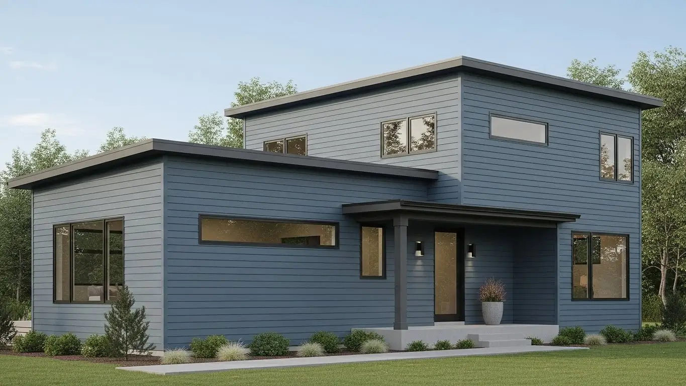
2. Soft Coastal Blue
3. Muted Evergreen
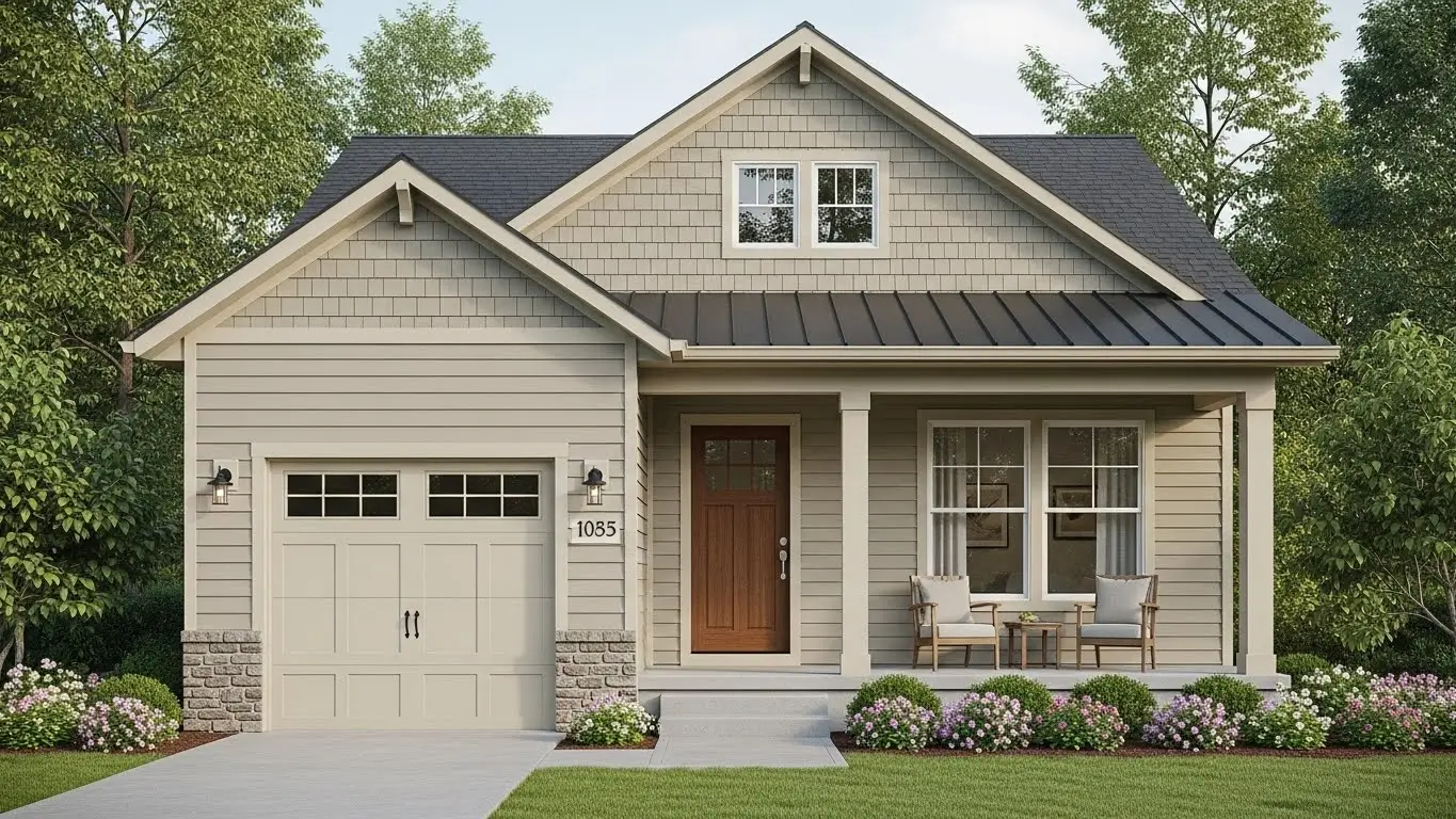
4. Classic Sand Beige
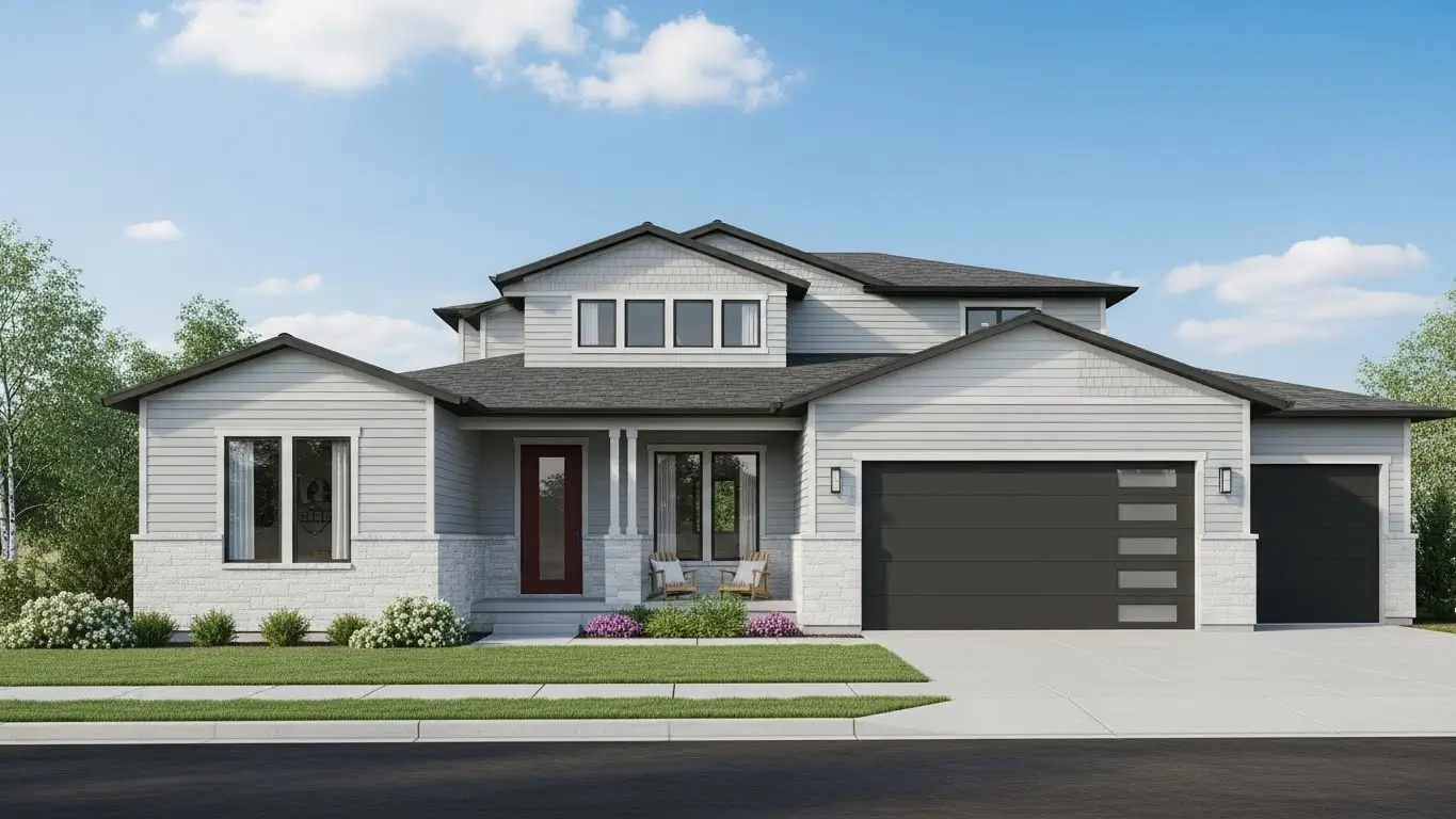
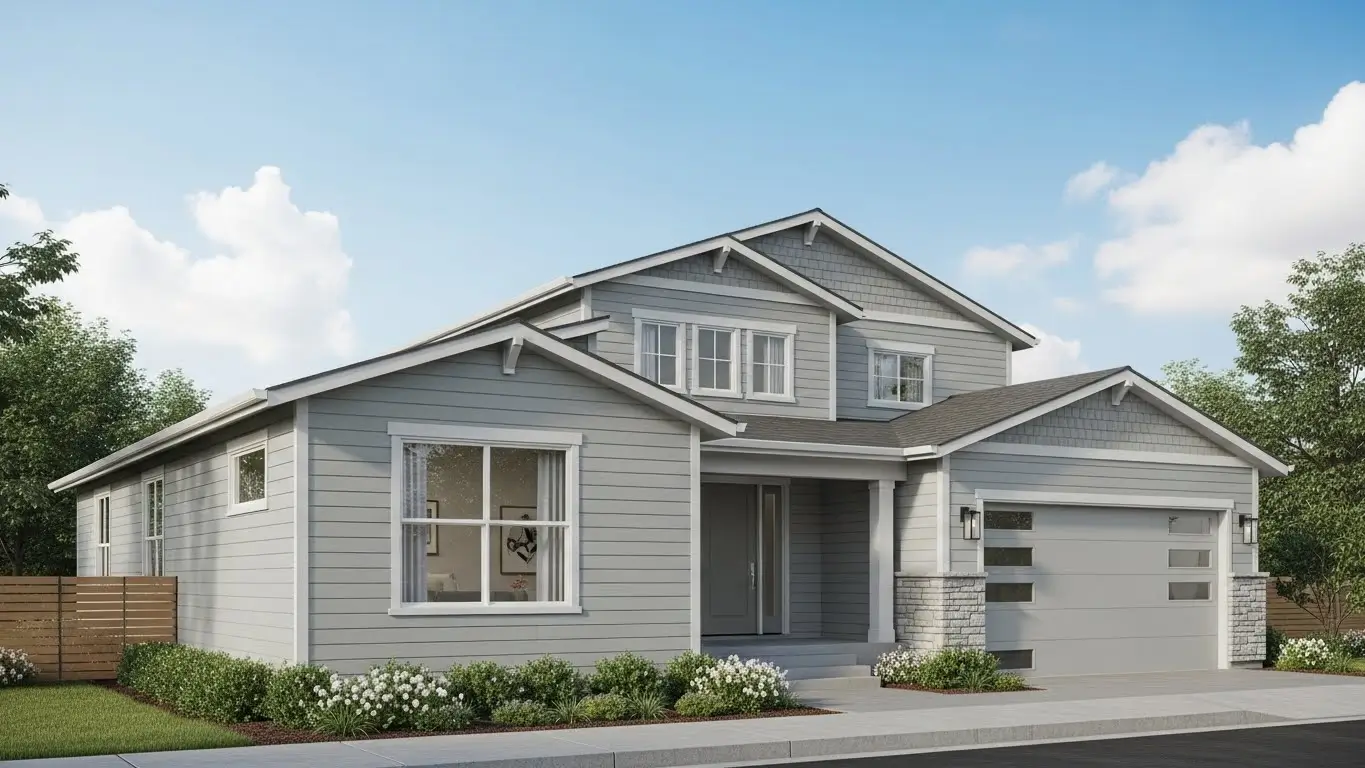
5. Mid-Tone Slate Gray
6. Forest Green
7. Light Granite Gray
8. Natural Maple Tone
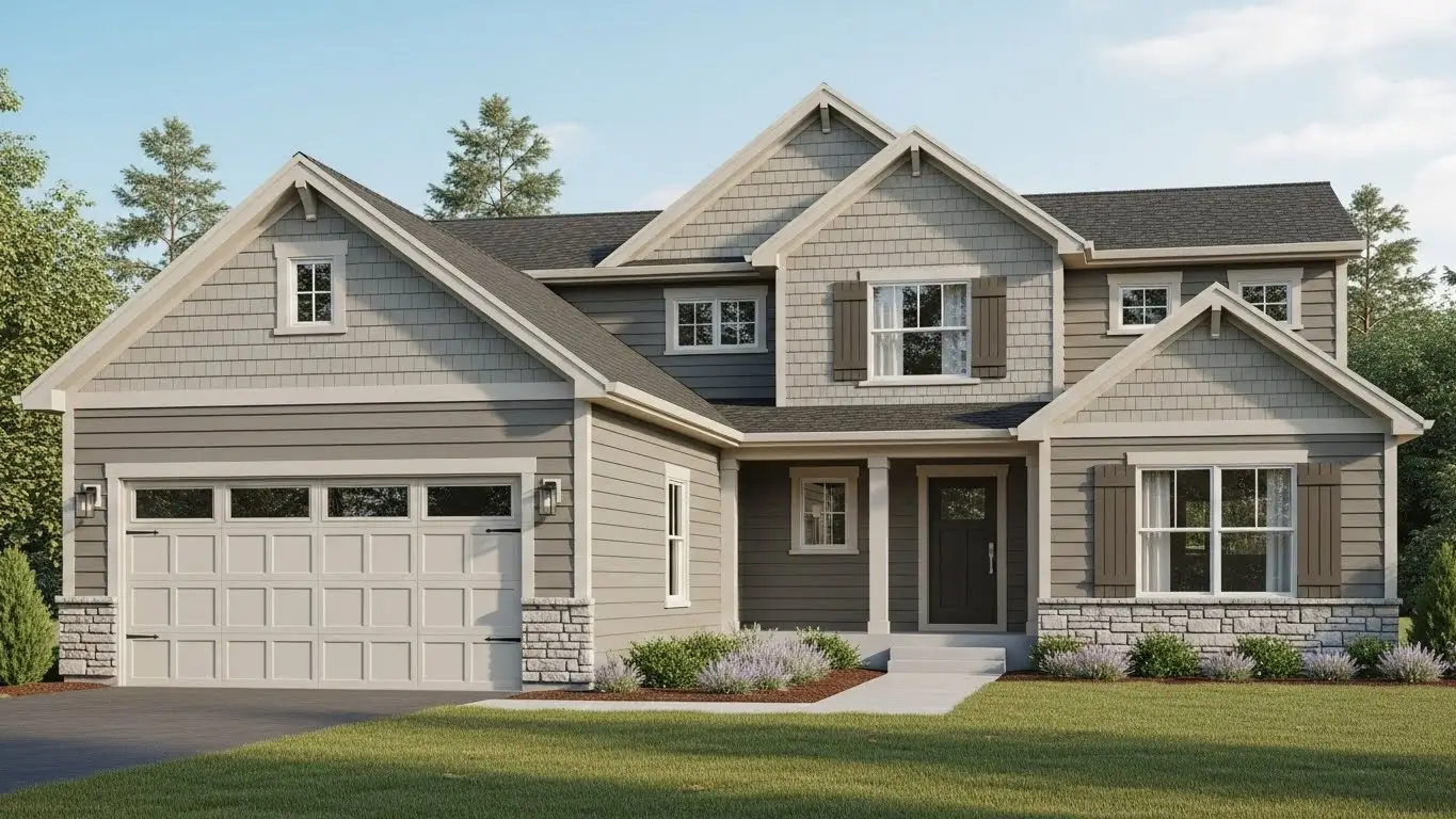
9. Warm Greige Blend
10. Soft Linen White
11. Pale Golden Yellow
12. Weathered Blue-Gray
13. Cool Clay Neutral
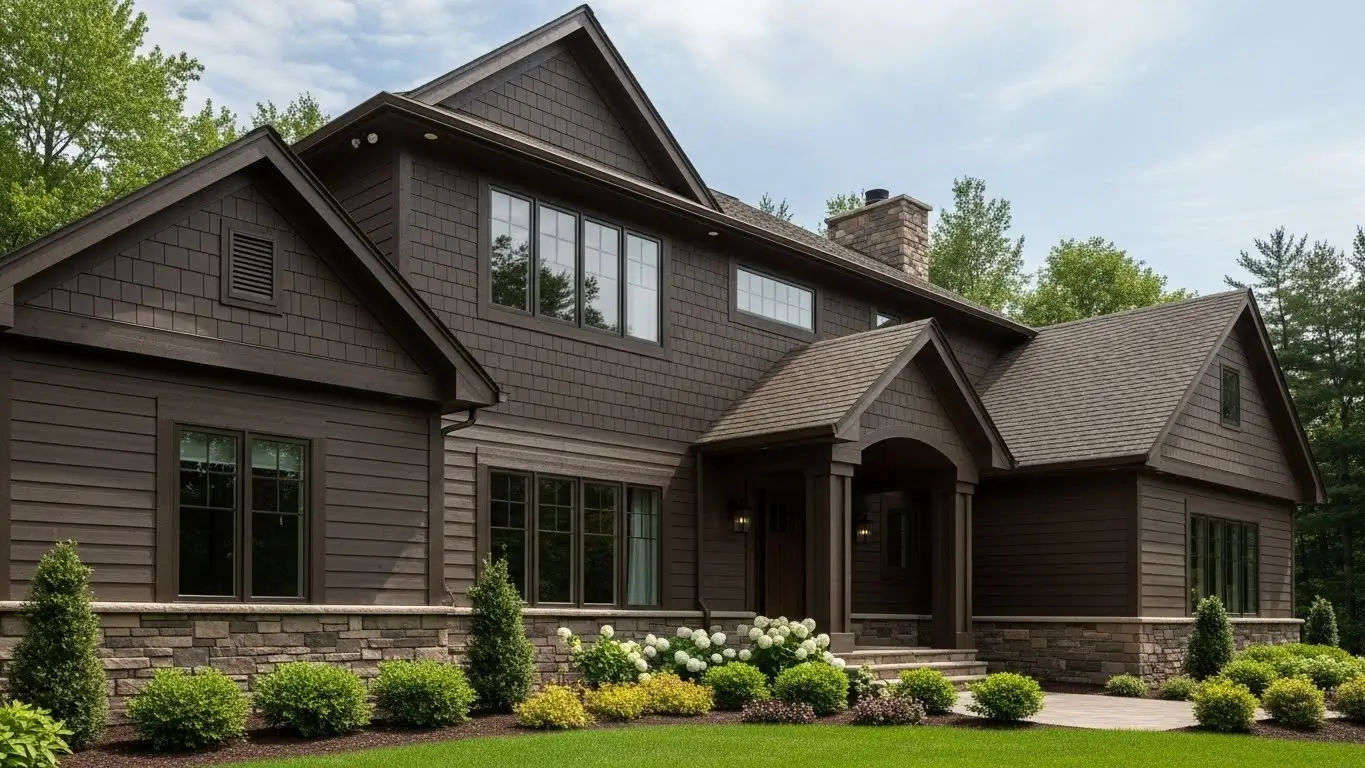
14. Rich Taupe
15. Olive Green
16. Deep Ocean Blue
17. Soft Pewter Gray
18. Dark Walnut Brown
19. Balanced Wicker Neutral
20. Crisp Snow White
Final Conclusion
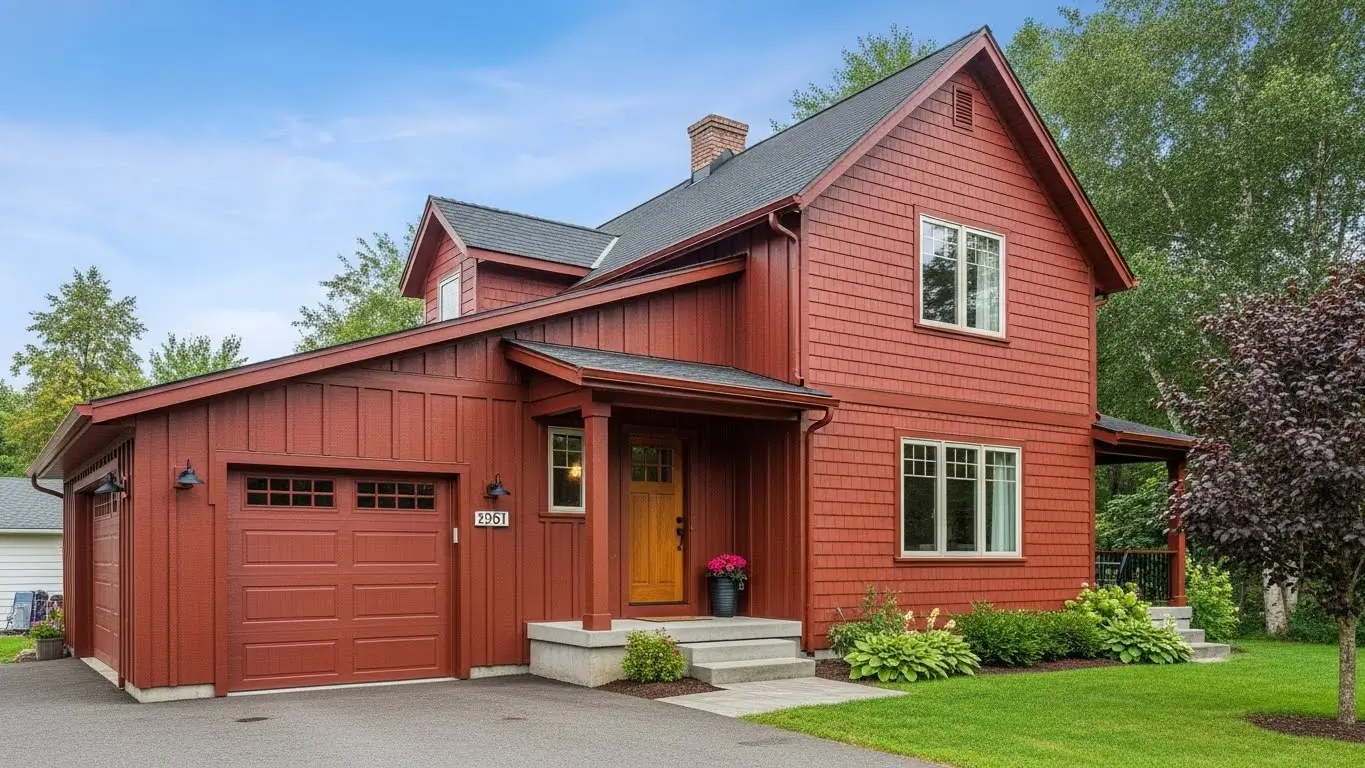
Warm barn red looks best on farmhouse, colonial, and traditional homes, especially in rural or open environments. When the red leans toward rust or brown rather than bright red, it feels classic and mature instead of bold. Homes with simple shapes and strong trim contrast benefit the most from this color choice.
This shade adds character and a sense of history, making the home feel established and welcoming. It naturally draws attention without overpowering the exterior, helping the house stand out in a refined and timeless way.
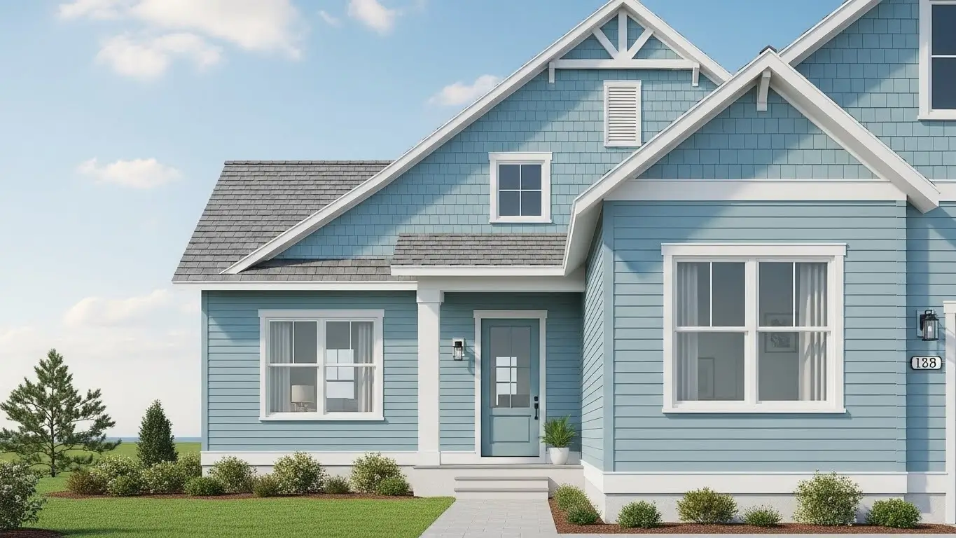
Soft coastal blue suits coastal homes, cottages, and suburban houses that receive good natural light throughout the day. It pairs well with white trim and light-colored roofs, giving the exterior a clean and balanced appearance. This color also works well on both single- and two-story homes.
The shade creates a calm and airy feeling, making the home look fresh and visually open. It adds color without feeling loud, which helps the exterior remain relaxing and inviting.
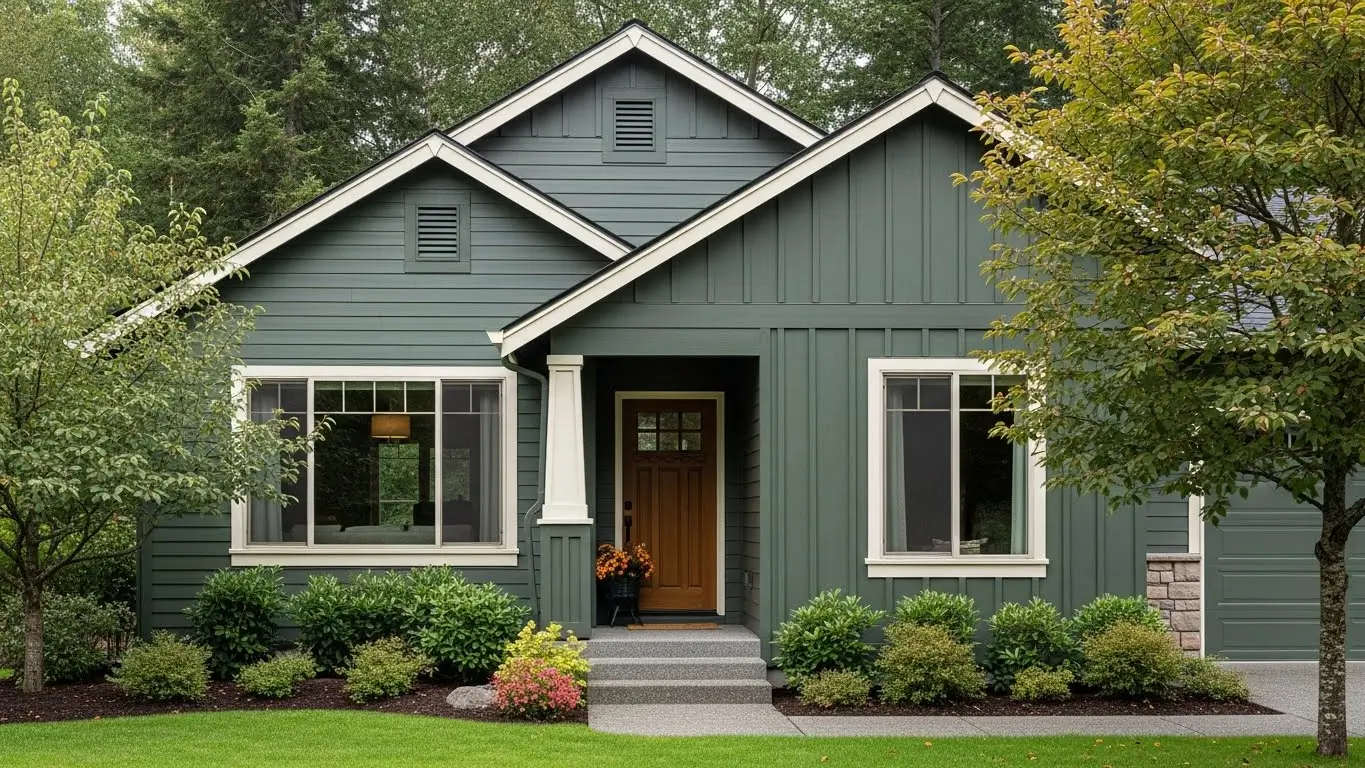
Muted evergreen works best on homes surrounded by trees, gardens, or natural landscapes. It blends into the environment rather than standing out sharply, making it ideal for craftsman, cabin, and nature-inspired homes. This color feels especially natural in wooded or quiet areas.
Because it is darker than beige or white, it helps hide dust and weather marks, keeping the exterior looking neat for longer. The home feels grounded and connected to its surroundings rather than visually separate.
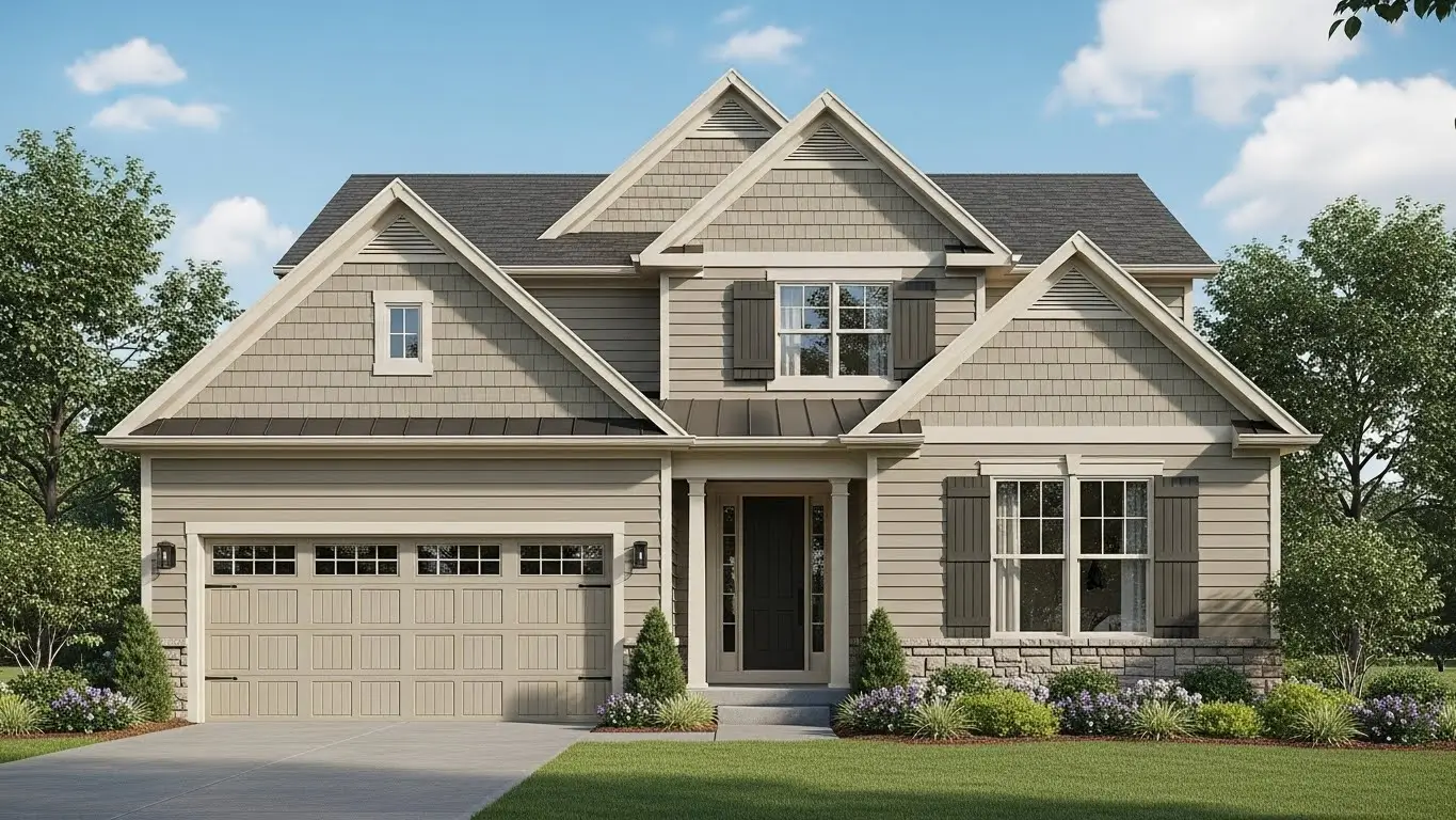
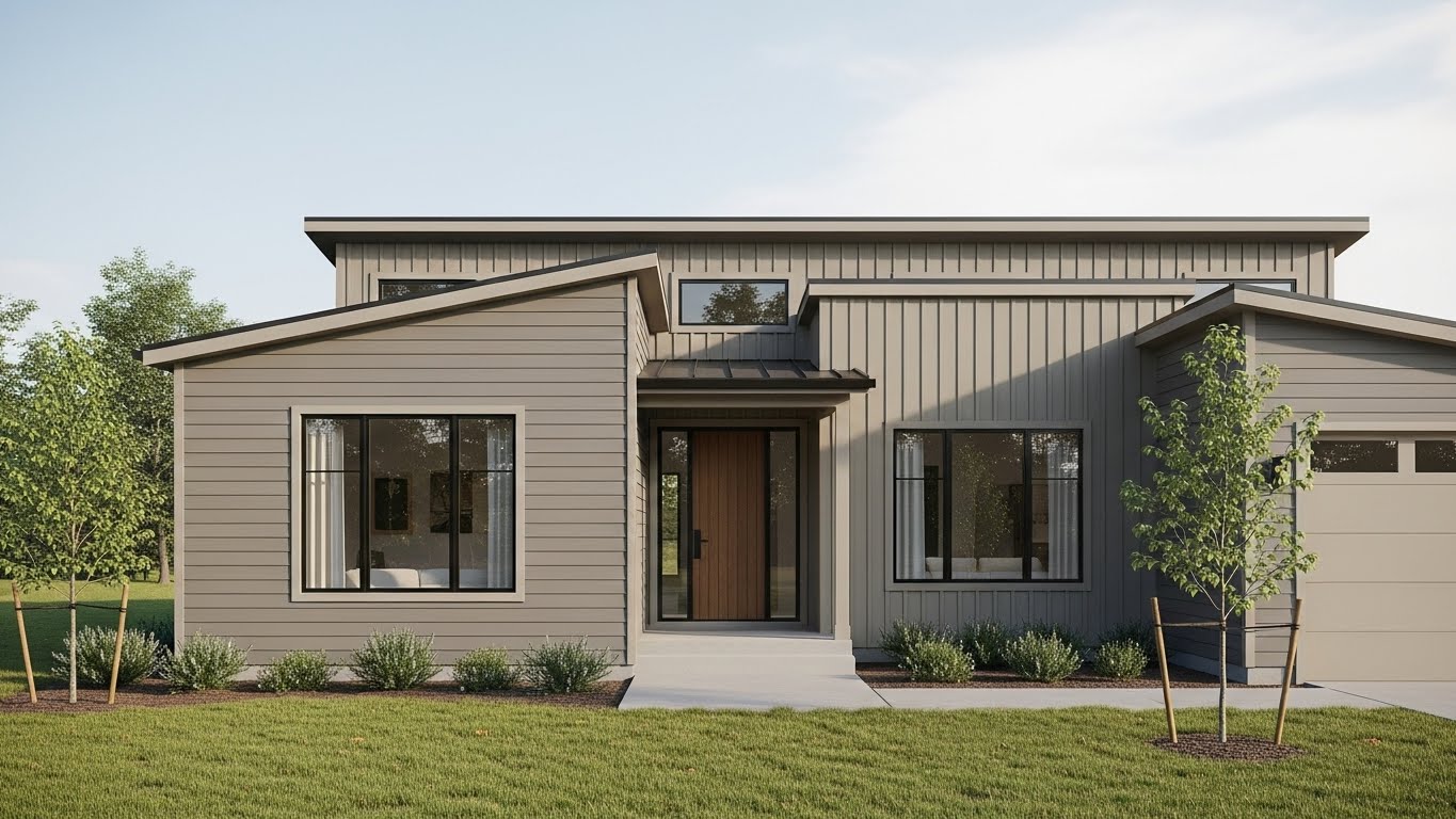
Sand beige works well on almost any architectural style, from traditional to modern homes. It blends easily in neighborhoods with mixed home colors and does not clash with surrounding properties. This shade performs well in both sunny and warm climates.
The color makes homes appear brighter and slightly larger, while staying neutral and safe. It also allows for easy changes to doors, trim, or shutters in the future without requiring a redesign of the entire exterior.
Mid-tone slate gray fits modern, transitional, and urban homes with clean lines and simple detailing. It adds depth to the exterior without making the house look dark or heavy. White, black, or wood accents stand out clearly against this shade.
This color creates a refined and modern look that feels balanced rather than trendy. It helps highlight architectural features while keeping the overall exterior calm and polished.
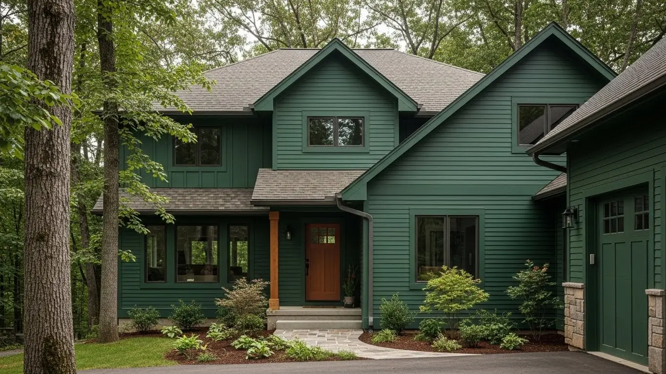
Forest green looks best in northern, rural, or wooded regions where homes are surrounded by nature. It pairs naturally with stone foundations, brick accents, and light trim. Larger homes benefit most because this color visually anchors the structure.
The shade adds richness and depth, helping the home feel settled and connected to the landscape. It gives a strong presence without feeling bold or overwhelming.
Light granite gray works well on smaller homes or properties that receive limited sunlight. It reflects light better than darker gray tones, keeping the exterior from feeling closed in. This shade is also common in urban and suburban areas.
The color helps homes feel more open and balanced, while still providing enough contrast to define edges and structure clearly.
Natural maple tones suit craftsman and traditional homes with visible architectural details. This shade works well as a base color because it feels warm without being dark. Homes with detailed trim, exposed beams, or natural materials look especially balanced with this color.
The tone adds warmth and subtle texture to the exterior, making the home feel comfortable and inviting. It also allows darker doors or shutters to stand out clearly while keeping the overall design calm and well-proportioned.
Warm greige is ideal for homeowners who want flexibility in exterior design. It balances warm and cool tones, which makes it suitable for many roof colors and trim styles. This shade works equally well in sunny regions and areas with frequent cloud cover.
Because it sits between gray and beige, it reduces the risk of color regret and keeps the exterior looking modern without feeling cold. The home stays visually balanced even as trends or surrounding colors change.
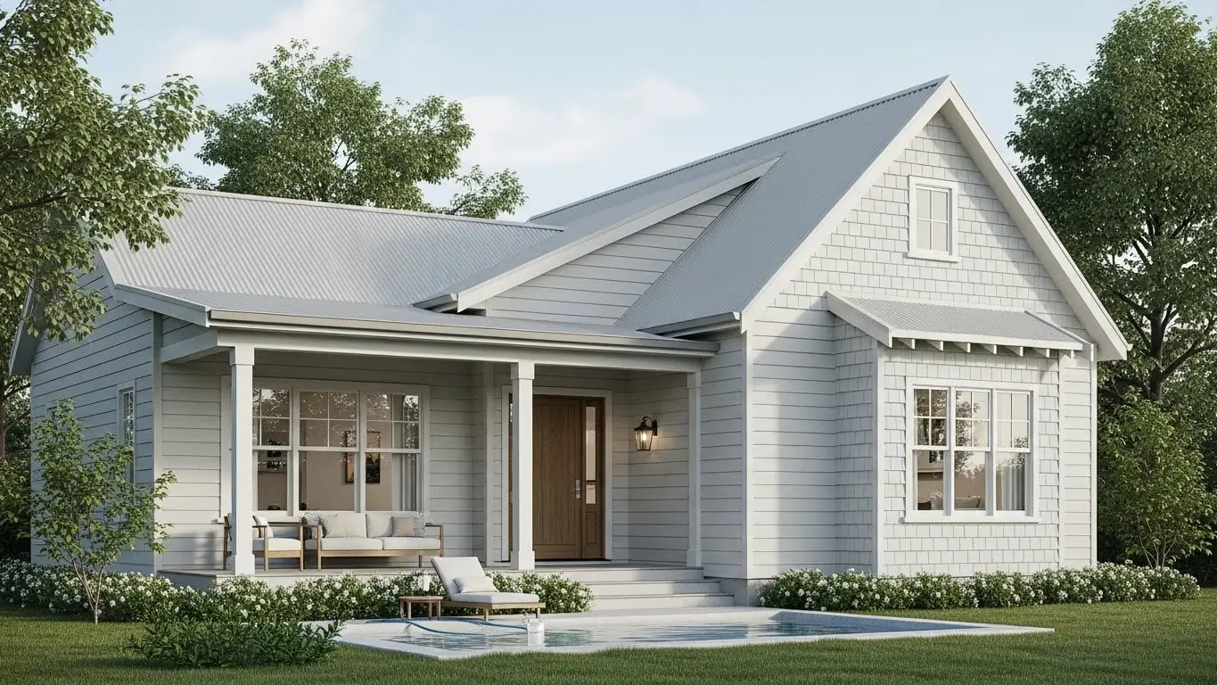
Soft linen white works best on colonial, farmhouse, and classic home styles where symmetry and details matter. It brightens the exterior without the sharp or stark look of pure white. Trim, windows, and architectural lines become more noticeable with this shade.
The color creates a timeless and elegant appearance that does not feel trendy or dated. It keeps the home looking clean, refined, and visually appealing for many years.
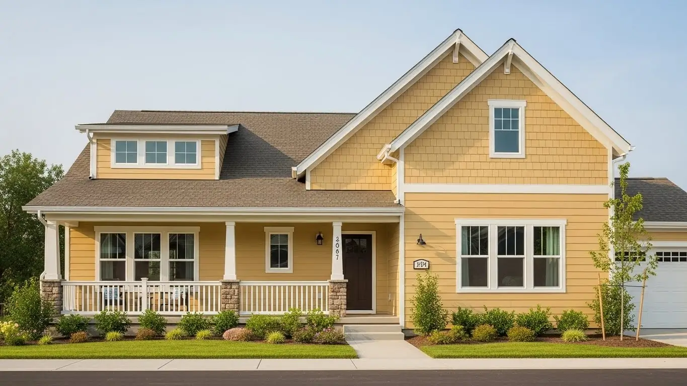
Pale golden yellow suits smaller or shaded homes, especially in cooler climates where extra warmth helps the exterior feel more welcoming. This color adds light without becoming bold or overpowering. It works best when paired with white or light trim.
The shade naturally brightens the exterior and makes the home feel cheerful and warm. Visitors often see this color as friendly and inviting rather than decorative or loud.
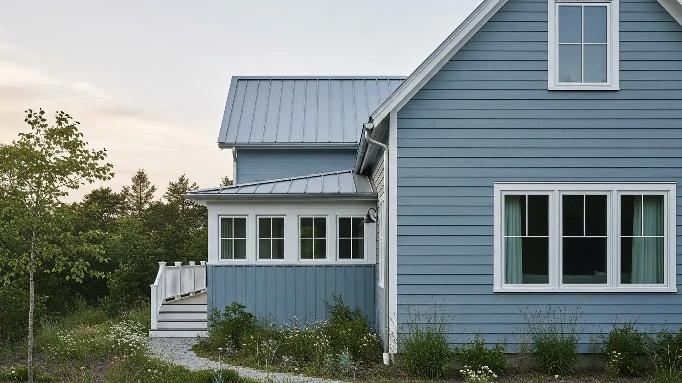
Weathered blue-gray works well on coastal, modern, and transitional homes. It balances cool tones with softness, which prevents the exterior from feeling harsh or industrial. This shade pairs well with neutral or light-colored trim.
The color adds depth without heaviness, helping the home feel calm and refined. It also holds its appeal over time, even as exterior design trends change.
Cool clay neutral works best on homes in warm or dry climates where softer earth tones feel natural. It blends smoothly with stone, concrete, and desert-style surroundings without looking washed out. This shade suits both modern and traditional homes that want subtle character.
The color softens the exterior and reduces visual harshness, helping the home feel calm and balanced rather than bright or bold.
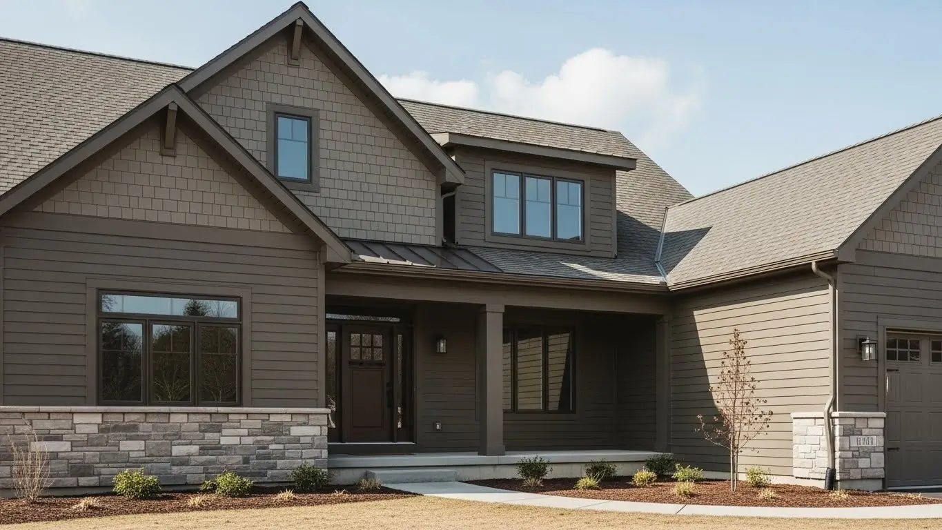
Rich taupe suits medium to large homes that need visual grounding. It pairs especially well with darker roofs, stone accents, and deep trim colors. This shade works well in neighborhoods where homes need to feel solid and well-defined.
The color adds depth and elegance, making the exterior feel stable and refined without making it look heavy or dark.
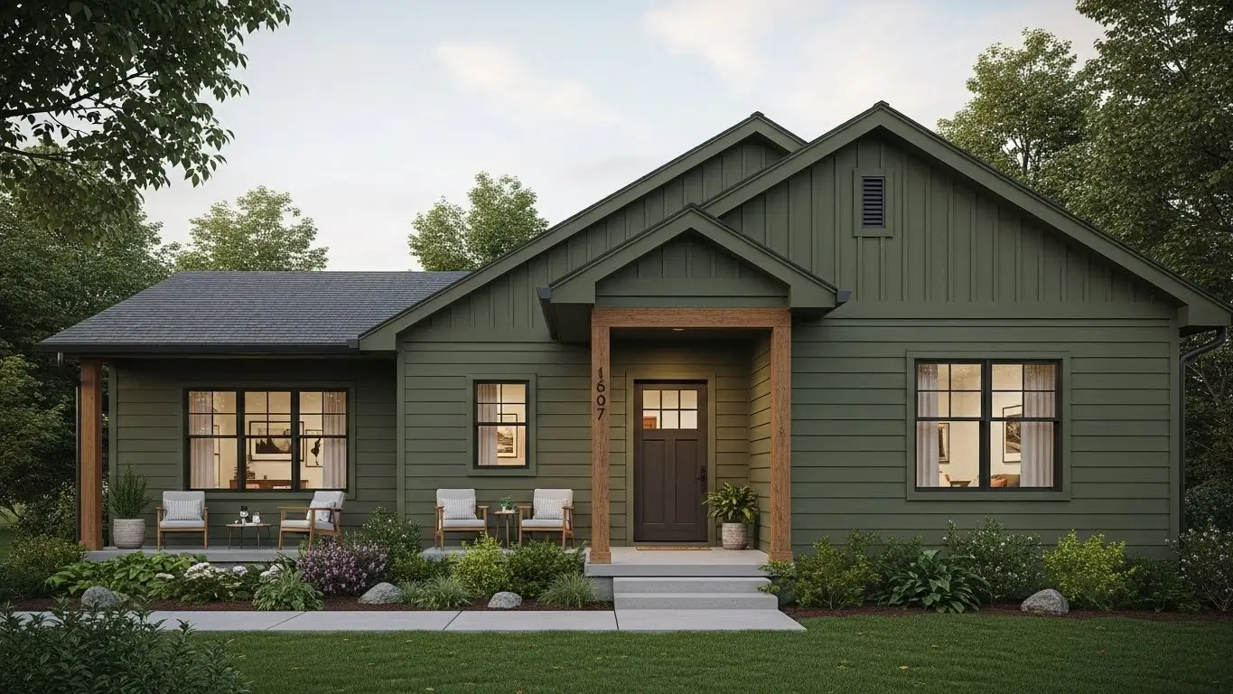
Olive green works well for homes that want color without strong contrast. It fits easily in suburban neighborhoods and also blends naturally in areas with trees or landscaping. This shade feels muted rather than decorative.
The color adds quiet personality while staying neutral-friendly, making it easier to pair with trim, roofing, and natural materials.
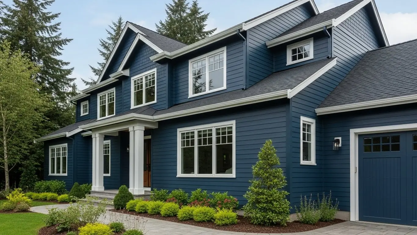
Deep ocean blue fits modern and coastal-inspired homes with clean lines. It looks best when balanced with light trim and simple exterior detailing. This color gives structure to the exterior without adding clutter.
The shade creates a confident and polished look, helping the home stand out in a controlled and elegant way.
Soft pewter gray is ideal for compact or urban homes where lighter colors help reduce visual weight. It keeps the exterior bright while still defining architectural lines clearly. This shade works well with black or dark trim.
The color helps smaller homes feel more spacious and well-finished, without appearing plain or flat.
Dark walnut brown suits wooded, southern, or rural homes where darker tones feel natural. It pairs well with light trim and natural materials like stone or wood. This color works best on homes with strong shapes.
The shade adds warmth and depth, making the home feel cozy, grounded, and inviting.
Balanced wicker neutral works best for homeowners who want flexibility in future exterior updates. It adapts easily to different trim colors, roofing styles, and landscaping changes. This shade fits many architectural styles.
The color offers long-term versatility, helping the home stay visually relevant without frequent repainting or redesign.
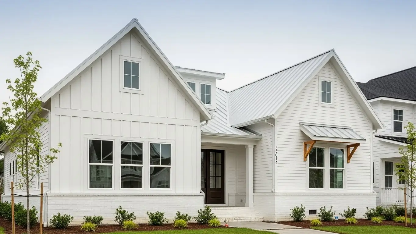
Crisp snow white fits traditional and symmetrical homes where clean lines matter most. It highlights trim, windows, and architectural details clearly. This shade works especially well with dark roofs and bold accents.
The color delivers timeless curb appeal, keeping the exterior clean, bright, and visually sharp for many years.
Choosing the right siding color is about more than personal taste. The color should match the home’s size, architectural style, natural light, and surrounding environment to create a balanced and pleasing exterior. When these elements work together, the home looks more welcoming and visually well-planned.
Well-chosen siding colors also help a home age better over time. Neutral and nature-inspired shades stay attractive longer, while balanced color combinations reduce the need for frequent exterior updates. By selecting a color that fits the home naturally, homeowners can improve curb appeal and enjoy a clean, confident exterior for many years.
The best siding color depends on your home’s size, architectural style, roof color, and surrounding environment. Choosing a shade that fits naturally with these elements usually gives the most balanced and long-lasting result.
Yes, lighter colors reflect more light, which can make a home appear larger and more open. This is especially helpful for smaller homes or properties with limited natural sunlight.
Darker colors can show fading or dust more than lighter shades, especially in sunny areas. However, they also hide some stains better and can add depth and richness when chosen carefully.
Siding does not need to match the roof, but it should complement it. Balanced contrast between siding and roof usually creates a more visually appealing exterior.
Neutral and nature-inspired colors tend to age better because they are less trend-driven. These shades usually stay attractive longer and reduce the need for frequent exterior updates.
Join our mailing list for exclusive updates, expert tips, and special offers tailored to your needs. Be the first to know about the latest in home services.

Renovize Home is a platform that supports homeowners from planning to renovation. Whether it’s Renovize AI for guidance or a one-on-one call with Pro Finder, we understand your project and match you with local contractors tailored to your needs.
Who We Are
About Renovize HomeGet in TouchHomeownwer Support:
Coming Soon!
General Inquiries:
support@renovizehome.com
Head Office:
24 Greenway Plaza, STE 1800M, Houston, TX 77046.